How to Use a Mood Board to Clarify Creative Direction
A mood board creative tool helps a team clarify atmosphere, compare visual references, and agree on a direction before detailed design decisions begin.
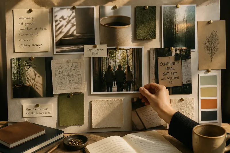
How do you use a mood board to clarify a project when “welcoming but not formal” means something different to everyone in the room? A mood board creative tool makes those impressions visible through a focused mix of words, images, and material cues.
The point is not to collect attractive pictures. It is to create a shared surface where people can compare what belongs, what feels off, and what needs another conversation.
What feeling should the board communicate?
Start with a few plain-language descriptions of the intended atmosphere. Phrases such as “quiet but not sterile,” “sun-warmed,” or “curious and slightly strange” give references a purpose without prescribing a color, typeface, or material.
Separate the feeling from the subject matter. A project about a garden does not automatically need leafy imagery; it might need to suggest order, humidity, abundance, or stillness. Naming that underlying quality keeps the board from becoming a literal illustration of the brief.
Where can you find useful references?
Look beyond polished campaign images. A shadow on a stairwell, the glaze on a cup, a handwritten menu, a folded map, or rain-streaked glass may communicate atmosphere more clearly than a finished brand identity.
Mix sources to show different aspects of the direction: a short phrase for pace, a photograph for light, and a piece of packaging for tactility. Keep source notes with borrowed images so their creators and context remain clear as the board circulates.
How do you choose and edit references?
For each candidate, ask what you want a collaborator to notice: compressed framing, generous empty space, a rough surface, or an awkward pose. If you cannot name a quality that connects it to the project, the reference may be decorative rather than useful.
Keep images that contribute different qualities, even if they do not look alike. Remove references that repeat a point, pull the mood in another direction, or need a long explanation to justify their presence. Preserve a contradiction only when that tension is part of the discussion you need to have.
- Observation: two images suggest the same lighting quality; if they repeat one another, keep the clearer reference, or retain both only if their differences help the group compare options.
- Observation: an image points toward a different mood; if that mood is intentional, place it beside the reference it challenges, or remove it if the contrast distracts from the direction.
- Observation: a reference needs a long explanation; if a short caption can clarify its contribution, add one, or replace the image if its relevance remains hard to see.
- Observation: the board has no example of a material quality the team needs to discuss; if that quality matters, add a focused sample or photograph, or leave it out if the project does not depend on it.
- Observation: a borrowed image has no source note; if its creator or context can be identified, record it beside the reference, or choose another image if you cannot establish appropriate use.
- Observation: people cannot see how the references relate; if grouping or spacing makes the connection clearer, rearrange the board, or add a concise caption if the relationship needs words.
How should you arrange the board?
Use placement to show relationships. Group references that share a quality, put an outlier beside the image it challenges, or leave space around the strongest emotional cue. Unless the board itself is a designed presentation, avoid polishing its layout so much that people mistake it for finished work.
Captions should point to the detail that matters. “Soft, uneven light” directs attention; a paragraph about the entire photograph can bury the visual cue. Add a brief note when an image could be misread, such as “Here for the hush, not the luxury cues.”
How can a team turn the board into a conversation?
Ask what people notice first, which reference feels closest to the intended atmosphere, and what seems out of place. These questions reveal how the board is being read; “Do you like it?” can turn the conversation into a vote on personal taste.
Say a small arts organization is preparing a printed program that should feel welcoming but not overly formal. The director starts with a staged photograph of people arriving, a close-up of softly textured paper, and a handwritten sign from a community noticeboard. The team decides the staged photograph feels too formal, keeps the paper and handwriting cues, and replaces the image with a more relaxed arrival scene; the observable result is a clearer shared interpretation of “welcoming,” not a finished design.
What should a mood board answer?
How many references should a mood board include?
Include enough references to make the atmosphere understandable, then stop when new images repeat or muddy the point. The right amount depends on the project and the people viewing it, not a fixed count.
Can a mood board include words as well as images?
Yes. Short phrases, material names, and notes about light or pace can explain what an image contributes. Keep the text concise so it guides attention without competing with the references.
Should a mood board show finished work?
Finished work can help when a particular quality is relevant, but it should not crowd out less resolved references. A board about atmosphere can draw from objects, places, and materials that have no direct connection to the final format.
What is not worth the effort when making a mood board?
It is not worth adjusting every image to match a shared color treatment or decorating the board before the direction is clear. Those moves can make a board look cohesive without showing whether its references communicate the intended feeling.
When should you revise the board?
Revisit the references when the format, audience, or a new decision reveals a mismatch. Mark which ideas still help, and note why the direction shifted—for example, “the close crops felt too private for a public display.” The board can evolve without treating every early image as a rule.
A mood board creative tool is most useful when it helps people describe the qualities they want to preserve, rather than argue over which finished-looking image they prefer. Keep the source notes and a brief record of decisions with the board; those small details make its direction easier to understand when the project moves into design.