Why Contrast Gives a Visual Pairing Its Shape
Learn how visual pairing connects words, images, materials, and formats through shared cues, helping distinct elements feel like parts of one composition.

A headline beside a photograph can feel like a caption accidentally left on the wrong page. A strong visual pairing gives each element a relationship to the other, using a shared idea, edge, or material cue—not simply making one louder than its partner.
That connection can come from subject, alignment, repetition, or the way one element answers another. Start by asking what the pair should say together, then choose a visible cue that makes the relationship easy to recognize.
What makes a visual pairing feel connected?
A pairing feels coherent when its elements share a reason to be together. A photograph of a paper map beside a route description has an obvious subject link; an abstract image beside a poem may connect through a repeated curve, a similar rhythm of marks, or a shared sense of movement.
Connection does not require matching colors, identical surfaces, or equal sizes. It can be as simple as aligning a caption with the edge of an image, repeating a shape from the image in a small graphic, or placing a word near the detail it names.
Say you are laying out a small exhibition card for a ceramic bowl and a short passage about its maker. If the passage mentions a thumb-pressed rim, crop the photograph so that detail is visible and align the text block with the bowl’s edge. The specific detail gives the words and image a reason to meet; if the rim is hidden, the pairing loses that link, so the crop or passage needs to change.
How can words and images answer each other?
Let the words contribute something the image cannot, and let the image contribute something the words cannot. A caption might identify a place, material, or moment, while the image supplies atmosphere and visual evidence. If both simply repeat the same information, the pairing can feel redundant.
Try placing a short line close to the relevant part of an image, or use a label that names a feature the viewer might otherwise overlook. Keep the connection clear enough that readers know which image the words belong to, especially when a page contains several pictures.
Not every image needs explanatory copy. A decorative photograph beside a title may add mood, while a diagram may need labels to make its parts understandable. Choose based on what a reader needs to perceive, not on a rule that every picture must carry text.
How do materials and formats shape the relationship?
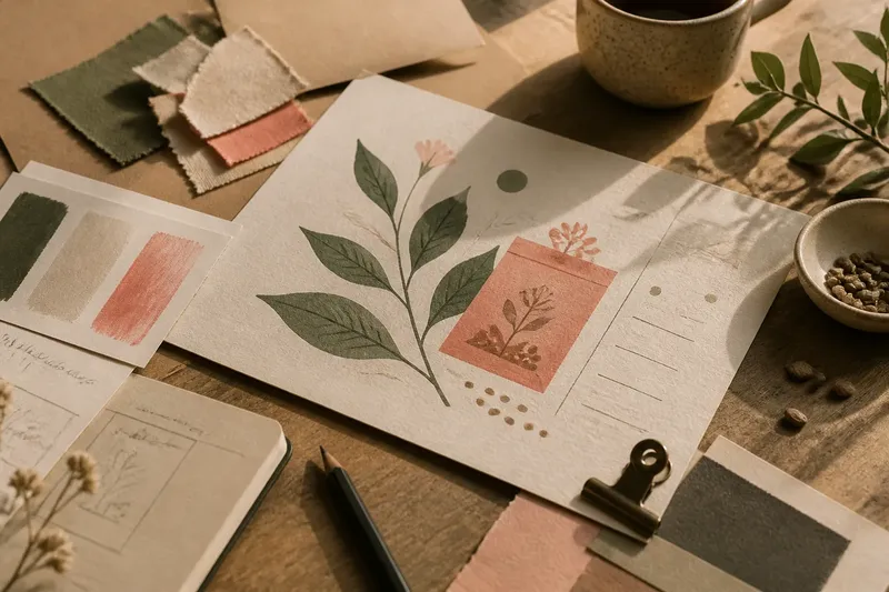
Materials can link elements through touch and process. A photograph of a stitched seam beside a piece of fabric, for example, connects representation with the thing represented; a pencil note beside a clean diagram can suggest observation alongside explanation.
Format matters too. A narrow column of text beside a tall image creates a different conversation from a full-bleed photograph with a small caption beneath it. Decide whether the format should bring the elements close, keep them separate, or make the viewer move between them.
For a physical display, consider the actual surfaces and viewing conditions: paper beside cloth, a printed label beside an object, or a projection next to a wall drawing. Use materials that support the intended relationship, and avoid adding textures or finishes merely because they are available.
How do you choose a connecting cue?
Choose one cue that makes the relationship visible, then check whether it survives in the final format. These practical checks can help you decide what to adjust:
- Subject link: Check whether the words name something visible in the image. If the named detail is present, place the text near it; if not, choose a better crop or revise the wording.
- Alignment: Check whether an image edge, caption, and text block share a clear line. If they do, keep that alignment; if they do not, align one edge or use deliberate spacing to establish a different relationship.
- Repeated shape: Check whether a shape or mark appears in both elements. If the repetition feels intentional, retain it; if it looks accidental, remove the extra mark or make the connection more explicit.
- Material cue: Check whether a surface or process supports the subject. If it adds useful context, keep it; if it distracts from the content, simplify the material treatment.
- Reading order: Check whether a viewer can tell which words belong with which image. If the connection is clear, preserve the placement; if not, move the caption closer or add a simple label.
- Final-size detail: Check whether the connecting cue remains visible at the intended size. If it does, use it; if it disappears, switch to a clearer cue such as proximity, a shared edge, or a direct label.
What questions help you refine a visual pairing?
Should the image repeat what the words say?
Usually, it is more useful for the image to add a related detail than to duplicate the text. Repetition can still help when a reader needs quick recognition, such as a label identifying the pictured object.
How can I pair unrelated subjects?
Find a meaningful shared feature, such as a shape, process, or idea, and make that link visible. If no useful connection exists, give the elements separate space rather than implying a relationship that is not there.
Where should a caption sit?
Place it near the image or detail it identifies, with enough separation to remain readable. If several images sit together, use consistent placement or clear labels so the caption’s subject is unmistakable.
What if the connection feels forced?
Remove the cue and see whether the pairing still makes sense. If it does not, choose a more relevant image, revise the words, or let the elements stand apart instead of adding decoration to disguise the mismatch.
How can you check the finished pairing?
Imagine you are arranging a gallery page with a photograph of a folded paper sculpture and a short note about how its creases guide the eye. First, select a crop where the folds are visible. Next, place the note beside the fold it describes and align the text block with the photograph’s lower edge. Then view the page at its intended size: if the fold and note still read as a connected pair, keep the arrangement; if the detail is too small, use a closer crop or move the note nearer to it.
It is not worth adding borders, shadows, and decorative marks when a relevant detail or shared edge already makes the connection clear. For a visual pairing, the main search phrase, a visible relationship between the elements, is often best served by one specific cue that helps the viewer understand why they belong together.