The Matching-Colour Myth: Why a Palette Needs Tension
A considered color palette needs more than close matches. Learn how to choose and place one purposeful accent that gives a poster, invitation, or display character.
A poster can use soft blue paper, gray lettering, and a careful illustration—and still feel bland if every color makes the same impression. A color palette with a purposeful point of tension gives the work a little friction, helping its character feel specific rather than merely coordinated.
Think of color as part of the voice of a piece, not just a way to direct attention. A sharp vermilion beside faded lilac can feel lively; a warm black alongside pale sand can feel quieter but still distinct. The useful question is what kind of relationship the colors create.
What mood should the color palette carry?
Start with a few words for the feeling you want: hushed, playful, earthy, formal, or uneasy. Those words are more useful than searching for colors that simply “go together,” because they give you a reason to keep or reject a choice.
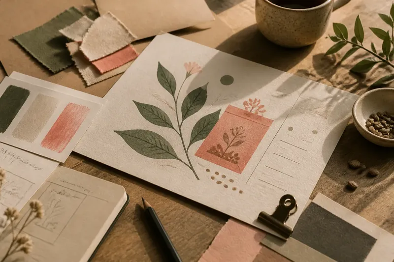
Consider the subject and the material at the same time. A small poetry reading printed on cream stock may suit a smoky blue and a precise flash of orange; a handmade market sign on kraft paper might call for deep green with a chalky pink. The colors should feel connected to the work, even when they disagree a little.
How can you build tension without making a mess?
Choose a quiet group of colors, then introduce one that differs in temperature, clarity, or texture. For instance, a set of dusty greens can take on a different character beside a clean pink. A near-black mark among pale, warm colors can create tension without introducing another vivid hue.
Try two candidate accents in the actual layout, not in a row of isolated swatches. Notice whether each one changes the character in a useful way or feels as if it belongs to a different project. If neither feels right, the supporting colors or material may be setting up the wrong mood.
Say you are making a handout for a neighborhood seed swap. You begin with sage green, cream, and a muted brown, then try a clear raspberry pink for the small illustration of a seed packet. It makes the handout feel more playful, but against cream paper it also feels too polished for the rough, handmade mood; switching to a chalky coral should keep the lively note while feeling closer to the other colors and the paper.
Should the accent be vivid or muted?
A vivid accent can feel crisp and energetic, while a muted one tends to sit more comfortably among softened colors. Neither is automatically better. Decide whether the project needs a clean interruption or a quieter change in tone.
Also consider how much of the color appears. A small vivid shape can feel like a wink; a broad block of the same color may take over the mood. If an accent seems too forceful, try reducing its area or choosing a less saturated version before adding another color.
How do color relationships change across materials?
Paper, fabric, paint, and screens each affect the impression of a palette. Cream stock can warm a color that looked neutral on a bright monitor, while a textured surface can make crisp shades feel less polished. Check the intended surface where possible, and use a physical proof for print when one is available.
Keep surrounding materials in view, too. A color that feels balanced on plain white may clash with a photograph, a colored border, or a patterned cloth. The aim is not to make every component identical in tone; it is to make their differences feel chosen.
What questions do people ask about color palettes?
Does every color in a palette need to harmonize?
No. A palette can feel coherent because its colors suit the same subject or mood, even if one color creates a noticeable contrast. Give that difference a reason to be there.
Can a neutral color create tension?
Yes. A warm near-black against pale, cool colors can feel just as deliberate as a bright hue. The contrast may come from temperature or character, not only vividness.
What if the accent looks wrong in print?
Check it on the intended paper beside the final surrounding colors. If it feels harsher or duller than expected, try a nearby hue or a more muted version rather than assuming the screen preview was exact.
How many accent colors should a small design use?
Begin with one accent when the design has a simple palette and a single mood to express. Add another only if it brings a genuinely different quality; otherwise, the colors may start competing for character.
How can you tell if the palette feels intentional?
Use these checks while the work is still easy to revise:
- Mood: Does the palette support the words you chose for the project’s feeling? If not, replace a color that pulls the mood elsewhere, or adjust the mood words to fit the intended direction.
- Material: Does the color still suit the paper, fabric, or screen background? If it clashes, try a nearby shade on the intended surface, or choose a different material.
- Accent character: Does the accent add a useful quality, such as warmth or playfulness? If it feels unrelated, swap it for a color with a closer relationship to the base, or remove it.
- Color area: Does the accent’s size fit the tone you want? If it overwhelms the piece, reduce its area, or choose a softer version; if it barely registers, give it more space, or select a clearer hue.
- Neighboring elements: Does the accent sit comfortably beside nearby imagery and lettering? If it jars, change the neighboring color, or test a different accent.
- Surface proof: Does a print proof or on-screen preview resemble the intended result? If not, revise the colors using that surface as your reference, or change the production surface.
For text, keep foreground and background easy to distinguish in the final format. Color should not be the only way essential information is conveyed; clear wording, a label, or a shape can carry meaning too.
What is not worth the effort?
It is not worth chasing a supposedly perfect combination before you know the mood, material, or subject. Nor does every small detail need its own custom shade. A compact palette with one thoughtful disagreement is easier to understand than a collection of colors chosen only because each looks appealing alone.
When refining a color palette, check whether its tension belongs to the project’s voice. A useful contrast can make the work feel more playful, handmade, or restrained without requiring every color to match. Keep the colors that support that character, and let the rest go.