Paper or Fabric for a Small Display?
Choose paper or fabric for a small display by matching surface, flexibility, and presentation style to the words and images you want people to notice.
Paper or fabric for a small display? Start with what you want a viewer to notice first: the crisp edge of a printed image, or the softer presence of a textile surface. The choice affects how words sit, how images read, and whether the display feels like a print, a hanging, or something in between.
What should the surface do?
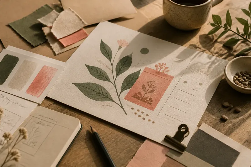
Paper gives marks a contained, often sharply defined field. A matte sheet can make small type feel calm and legible, while a coated sheet may bring brighter color and a more polished look. The paper’s texture matters, too: a toothy stock can lend a handmade quality, but very fine lettering may appear less crisp on it.
Fabric brings its own visible weave, even before you add an image or words. Cotton canvas can read as substantial and familiar; a lighter, tighter cloth may feel quieter and more like a backdrop. That texture can enrich a simple graphic, but it can also compete with delicate details.
Try judging samples under the light where the display will hang. Glossy paper can catch glare, and a fabric’s weave may become more obvious under raking light. A quick glance from the spot where a visitor will stand tells you more than inspecting either material close up.
How will the material hang?
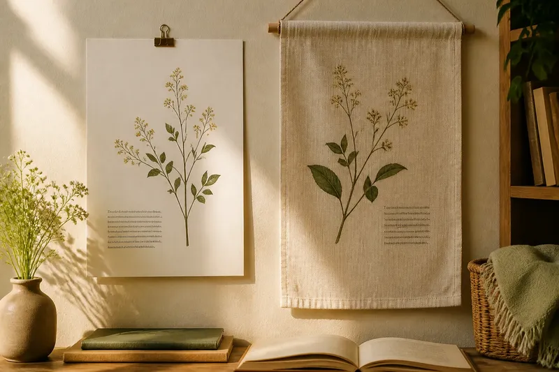
Paper holds a shape and gives you a firm edge to align with a wall, clip, or narrow frame. It is especially suited to a small display that should look like a poster, notice, or compact print. A heavier sheet tends to feel more self-contained, while a lighter one can curl or ripple if it is not supported.
Fabric bends, drapes, and moves with the air around it. That looseness can make a small piece feel welcoming rather than formal, especially when the display is meant to hang freely. But a soft edge is harder to keep square, and a textile may need a rod, clips, or a backing to hold its intended silhouette.
Imagine you are making a small display for a quiet reading corner, with a short line of text and a botanical drawing. If you want the drawing’s fine stems and the words to stay crisp in a slim frame, a smooth matte paper is a natural fit. If you want the same content to feel like a gentle hanging, a closely woven fabric with generous spacing could support that mood; the expected visible difference is a softer outline and a more tactile field.
Which one suits the image and words?
For fine linework, small captions, and precise alignment, paper is usually easier to compose on. It gives you a stable plane for arranging a headline, image, and margins, and it is straightforward to trim into a clean rectangle. A surface that is too textured or reflective can make the details harder to read.
Fabric favors images that can tolerate a little softness: broad shapes, simple lettering, and marks with room around them. If the design depends on tiny labels or narrow strokes, the weave may interrupt their edges. Give the artwork some breathing room rather than asking the cloth to carry a crowded layout.
Neither material dictates a single visual style. A paper print can feel warm with a generous border and restrained type; fabric can look graphic and crisp when its weave is fine and its composition is simple. Think about the relationship between the material’s natural surface and the marks you plan to place on it, not just which one seems more decorative.
What should you check before choosing?
Will the display be framed or left loose?
A frame supports paper’s straight edges and can protect a delicate surface. Fabric can also be framed, but its folds and bulk need room; left loose, it may need a simple hanging support to keep it from slumping.
Does the design rely on fine detail?
Small type and intricate lines tend to benefit from paper’s stable, smooth field. On fabric, consider larger lettering and simplified shapes so the weave does not swallow the design.
Will light fall directly on the surface?
Look for glare on paper and shifting shadows across fabric. A sample viewed in the intended spot can reveal whether the surface distracts from the message or image.
Does the piece need to be moved often?
A mounted paper sheet is easy to carry without changing its shape, while an unmounted textile packs more softly but may crease. Think about how the piece will be stored and reset, not only how it looks on the wall.
Which details are worth the effort?
Make a small material mock-up with the actual type size, image, and edge treatment. A scrap of the chosen paper or fabric is enough to reveal whether the text feels crowded, the image loses definition, or the surface adds a useful note. If you are printing on fabric, check the printer or supplier’s guidance for compatible cloth and ink; for a framed piece, confirm that the chosen mount can accommodate its thickness.
It is not worth building an elaborate backing or adding decorative borders before you know the material’s basic behavior. A clean cut, a sensible margin, and a hanging method that suits the surface often do more than extra embellishment.
For paper or fabric for a small display, choose paper when a composed, crisp presentation is doing the work, and fabric when drape and touch are part of the message. Let the surface earn its place: if viewers notice the words or image before they notice the material, the pairing is probably serving the display well.